Inside Electric Wildflower — The Prints, the Palette, the Whole Story
Let's talk about the actual collection.
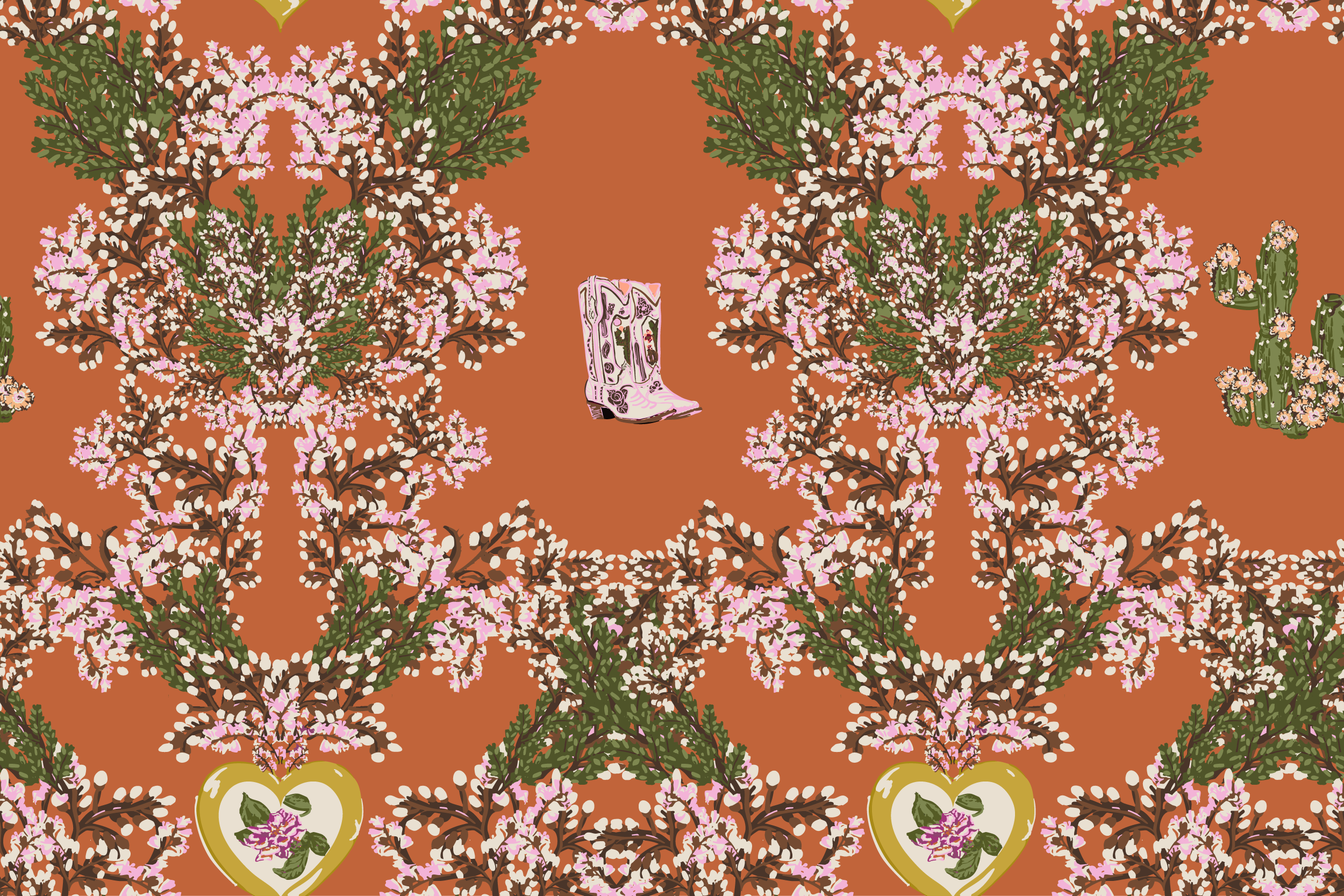
Electric Wildflower is built around a palette I keep coming back to because it just works — sun-drenched sand and palm-desert neutrals as the ground colors, with pink, orange, yellow, and sunwashed coral doing all the talking on top. It's warm without being heavy. Summer without being kitschy.
The hero prints are the blurred florals — loose, painterly, big in scale — the kind of print that looks incredible on anything with movement. Think a flowy linen, a swim coverup, a breezy graphic tee. Sitting alongside them are the vector prints: bold, directional, and graphic, giving the collection real edge.
The coords pull back the scale and the color, giving the collection range, from a statement piece to something that lives quietly alongside it. What I love about this group is that it doesn't feel like just one thing. It can go coastal, festival, or resort. The palette is flexible enough that a brand could take it in multiple directions depending on how they use it.
It's a full story. And it's available for licensing.
Next week: who this collection was made for — and how to get it in front of your customers.