The Marker Set — and the Print Leading the Collection
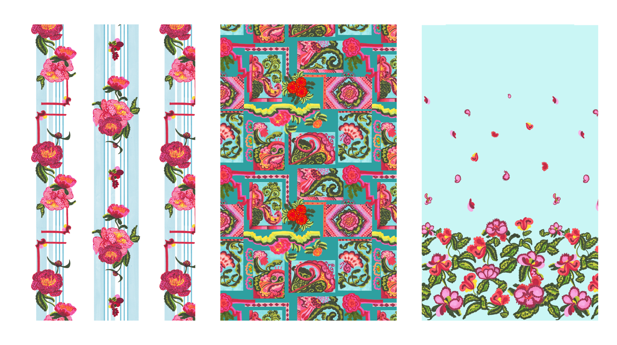
Every collection has a print that ends up doing more work than it was built to do. In Picnic Club, that's the postcard patchwork.
It started in the same place as everything else in this group — marker. Tighter, more linear, more controlled than the watercolor work that opened the collection. But somewhere between the painting and the final repeat, this one stopped being "a print in the group" and became the print — the image that now leads the entire Picnic Club case study.
That's not usually the plan. Groups are built to work as sets, not to produce a star. But a patchwork of postcard-style vignettes turned out to be the most legible way to show what this whole collection is actually doing — a lot of small, specific moments held together by one thread, which is exactly the structure of Picnic Club itself, just made visible in a single print.
The two prints built around it do what supporting prints are supposed to do — hold the frame without competing for it:
The floral stripe keeps the marker technique but drops the vignette structure, giving the group a simpler coordinate to pair against the busier hero.
The hem placement print is the most functional piece in the whole collection — built specifically for where a garment ends, not to repeat across it.
Three groups, nine prints, one thread of turquoise running through all of them — and one print, from the last group I painted, that ended up being the face of the whole thing.
That's Picnic Club, start to finish. Thanks for following along this month — more from the studio soon.