The Watercolor Table
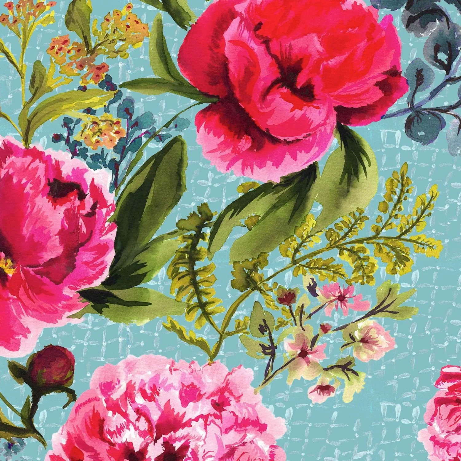
Every collection needs a print that does the talking, and in this group, that's the peony on net.
It started the way most of my hero prints do — gouache, wet-into-wet, no plan for exactly where one petal would bleed into the next. That looseness is the whole point. Blurred florals are everywhere in fashion right now, but there's a difference between a print that was built blurred in software and one that was actually painted that way. You can tell. The edges don't lie.
Once the painting existed, the job became building a group around it — not matching it, supporting it.
The blurred stripe takes the same soft-focus quality and turns it linear — a stripe with the edges still slightly out of focus, so it reads as a coordinate rather than a copy.
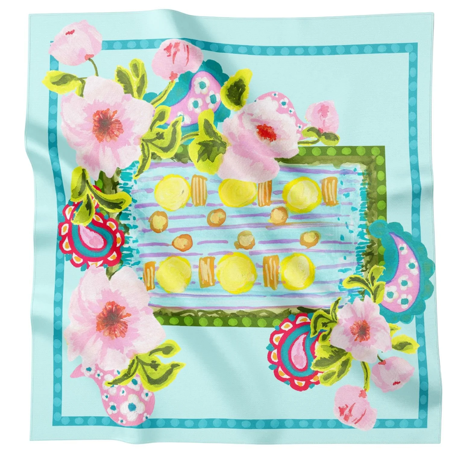
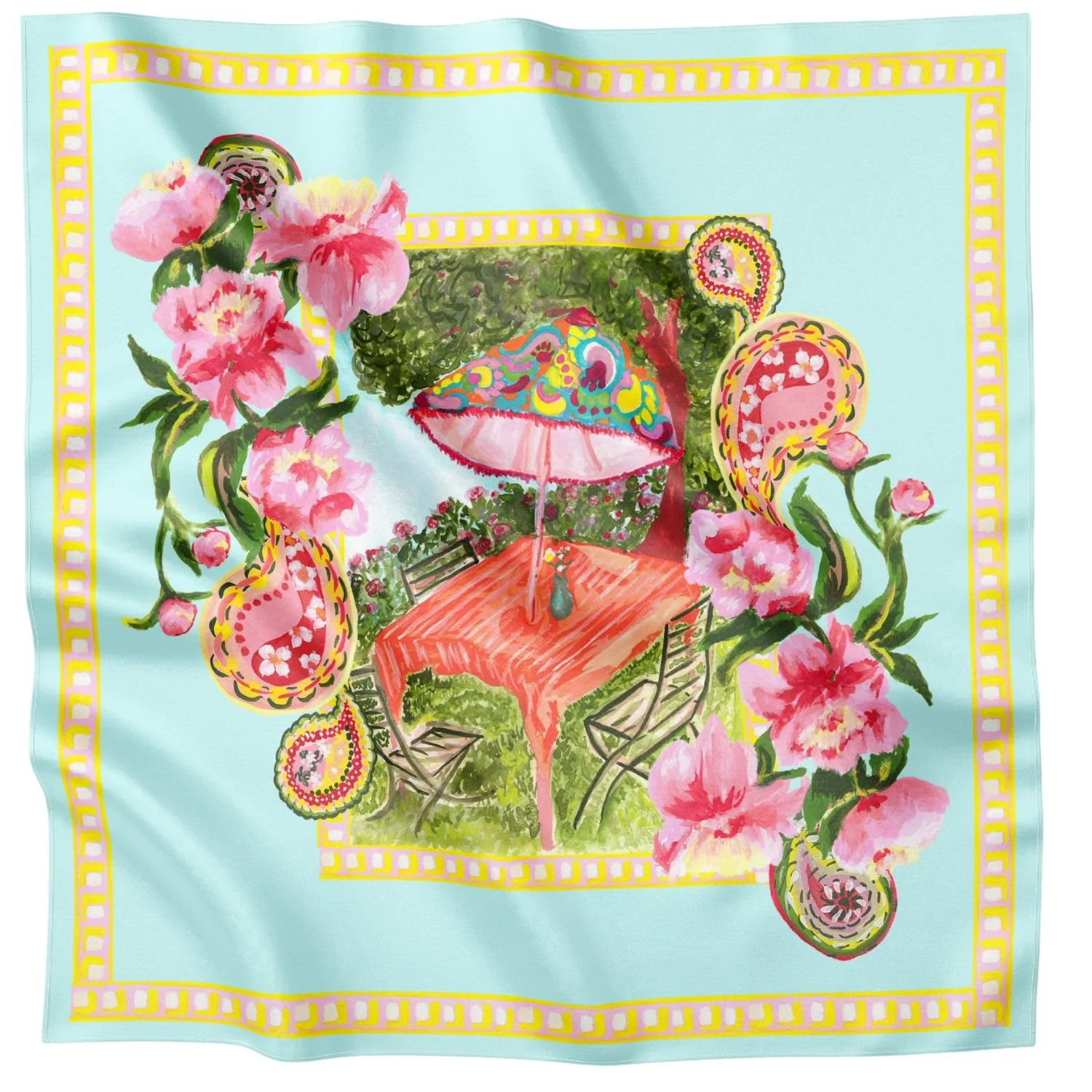
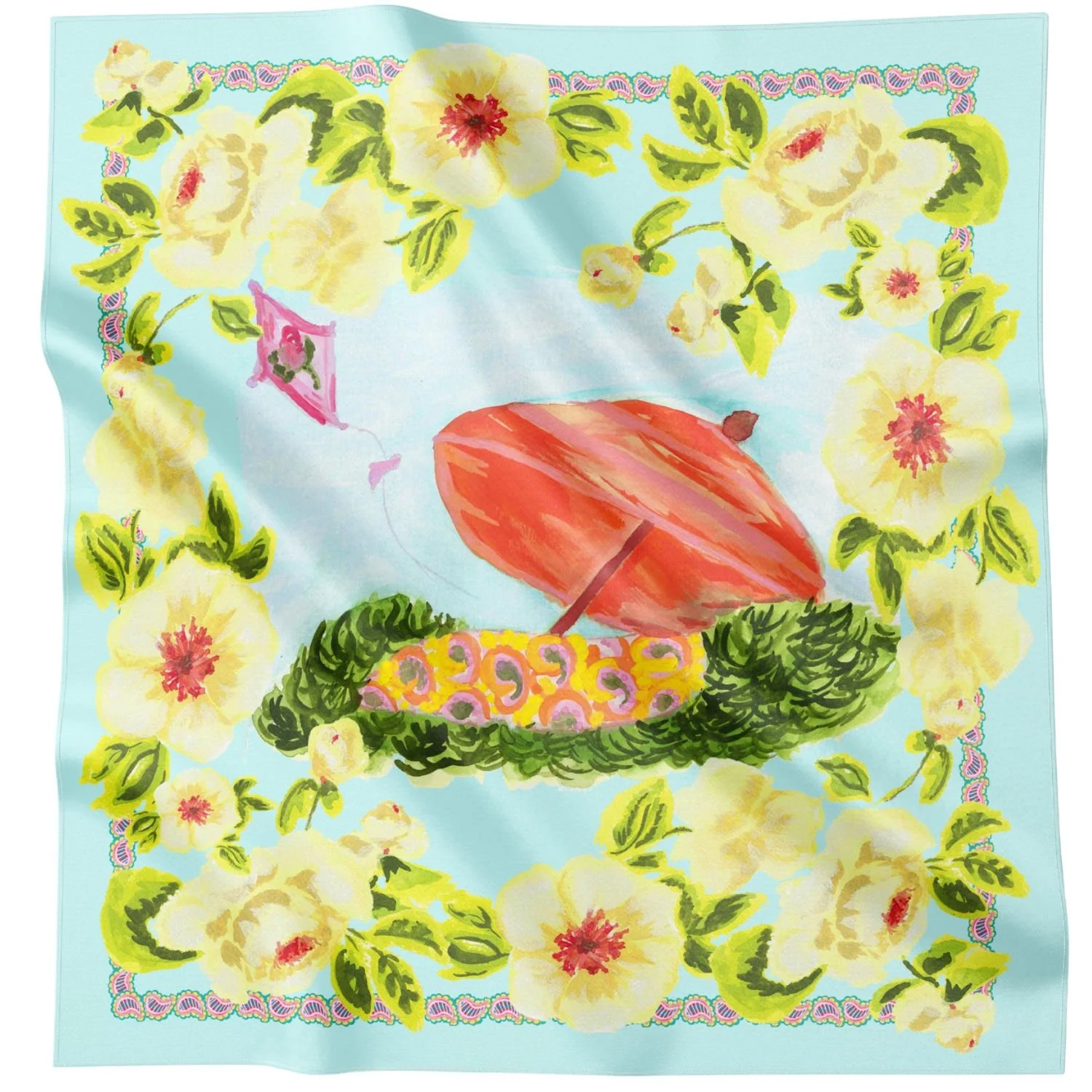
The engineered silk scarf is the most structured piece in the group, placing the peony motif with intention rather than letting it repeat freely — the kind of print a buyer can see finished on a garment before it's even sewn.
Three prints, one technique, one hero doing the heavy lifting. That's the watercolor table.
Coming next week: the collection turns a corner into cyanotype blue.